It will come as no surprise that we at the Case Writing Centre are lovers of the written word. But sometimes we have to ask: Why say it – or indeed, write a whole essay about it – when we can show you? We regularly hear from educators and professionals alike that, in the age of data overload, data visualisations are important learning tools that can make their lives easier, communicating important insights in a fraction of the time and catching the attention of readers, encouraging them to learn more.
This was the inspiration behind the infographics included for every DBIA case. We partner with graphic designer Leah de Jager, who transforms our selection of data into a visual story about the country and industry contexts of our cases. “A good infographic minimises the work the viewer has to do to understand an idea. It should tell a story in a way that is bite-sized and easy to digest,” says de Jager. This is what we aim to do with our Exhibit A feature.
A real snapshot
No traditional business case is complete without pages and pages of data-dense exhibits for readers to scour and analyse as they try to make sense of the central dilemma in the case. Part of the reader’s job is to mine these exhibits – which usually consist of company financial data, market research, competitor information, and other supplementary data – for evidence of the root cause(s) of the company’s problem, and insights about where to focus their recommendations.
Of course, the tables, graphs, and diagrams found in exhibits almost never capture the full scope of information that companies draw on to make critical decisions. No case can ever provide all the relevant data (and readers would hate us if they did). But the exhibits at least offer a snapshot of the kinds of information that tell a bigger story, and allow students to perform a rigorous analysis of the case situation.
"A good infographic minimises the work the viewer has to do to understand an idea." - Leah de Jager
Building on the idea of the “snapshot”, the deconstructed cases of the DBIA series contain an infographic, Exhibit A, that gives readers a visualisation of the country and industry context for each company. For instance, we have taken snaps of digital transformation in Kenya, business process outsourcing in South Africa, and agriculture in Nigeria.
Written in the skyline
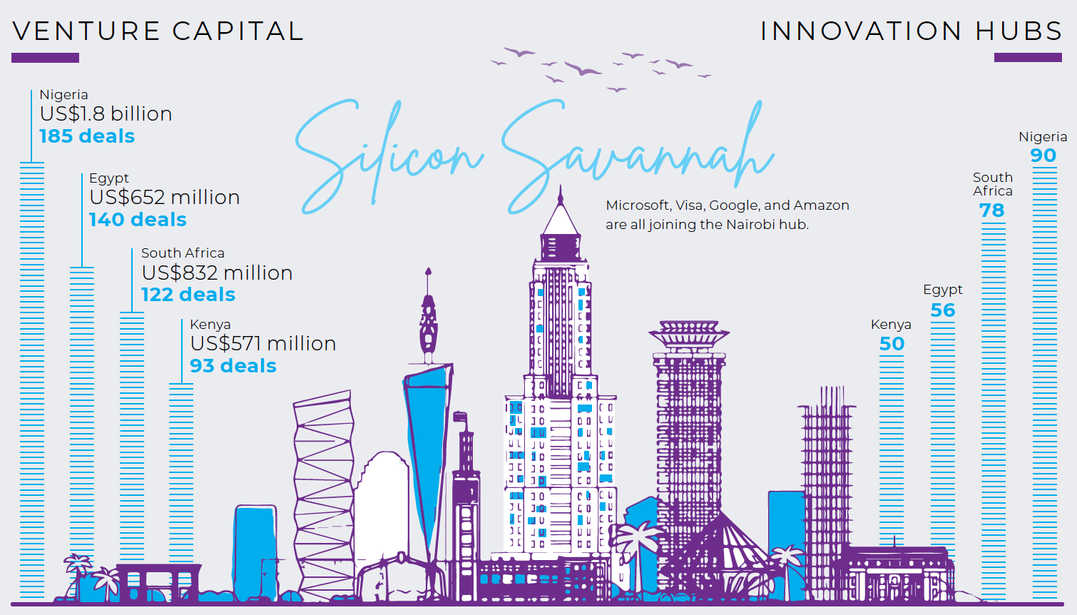
In our early design thinking interviews with key stakeholders for the DBIA series, many revealed that they don’t have even an armchair view of the industry activity in other African countries, largely because of scarce or insufficient media coverage. Exhibit A helps to fill this gap, easing readers in with a few data points that contextualise the case country’s performance within the broader African ecosystem, before focussing on unique elements of the local industry. We answer questions like: How does food security in Nigeria compare to the most and least food secure on the continent? Or: Which African metros have the most incubators and attract the most venture capital?
The visual answers to these questions are overlaid with the skylines of the African towns and cities that our case companies call home – an intentional choice for the DBIA case series.
“Leah drafted this beautiful skyline of Nairobi for our first case about digital transformation in Kenya when we were still standardising the layout and format,” says CWC Editor Sarah Boyd. “And we realised it was another way to advance the mission of this case series, which is to showcase African business hubs, highlight what makes them unique, and make them more recognisable to our readers. The African skylines do this in a very literal way and they are now a mainstay of the DBIA infographics.”
Below the skyline, readers can see the national industry characteristics “by the numbers” on the country map, followed by visualisations that dig into local dynamics that are particularly relevant to the case. For example, on the Hello Tractor case, “Exhibit A: Agriculture in Nigeria” digs into the dynamics surrounding smallholder farmers, which play a major role in the local economy and represent Hello Tractor’s target market.
To be sure, the data presented in Exhibit A, which is sourced from a broad range of rigorous academic, international, and local institutions, just scratches the surface of what are complex and multifaceted economic, social, and political issues. But in telling an abbreviated story about an African industry at a particular point in time, they invite readers to dig deeper into the story and learn more.
Get the data
Check out all the infographics in the current DBIA collection.

|

|

|

|

|
NEXT UP: A look behind the DBIA link roundup, the Reading List


